Bootstrap 4 (and higher) comes with a suite of handy utility classes for handling common yet fickle styling issues like spacing, borders, sizing, layout, colors, and more.
Add margin
If you look at the
source for the theme demo app, the actionButton() logic
makes use of the margin spacing (m-2) to add some spacing
between the buttons (they also make use of button
modifier classes to achieve their different background colors).
actionButton("primary", "Primary", icon("product-hunt"), class = "btn-primary m-2")
actionButton("secondary", "Secondary (default)", class = "m-2")
actionButton("success", "Success", icon("check"), class = "btn-success m-2")
It’s worth noting that actionButton(), like many other
core shiny UI components, doesn’t actually have an explicit
class argument, but it does route implicit arguments (i.e.,
...) to its top-level HTML tag, which is why
actionButton(..., class = "btn-primary") add the class in
the appropriate place. Another place where this top-level
class can be useful is for customizing the body of a
tabPanel().
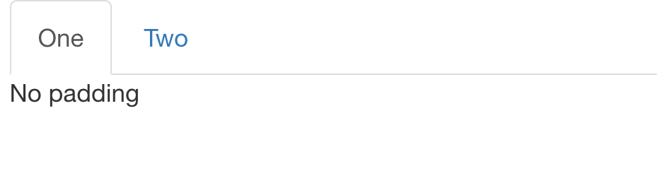
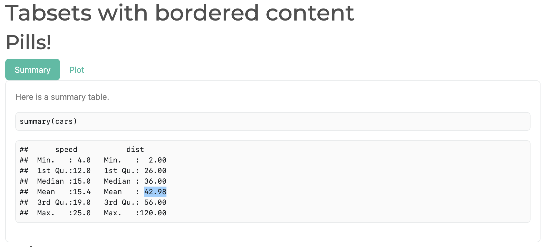
Add padding, borders, and alignment
By default, tabset panels don’t come with any padding or border(s) around the body’s content, which can make it appears though the content is just floating in space:
tabsetPanel(
  tabPanel("One", "No padding"),
  tabPanel("Two", "Very sad!")
)
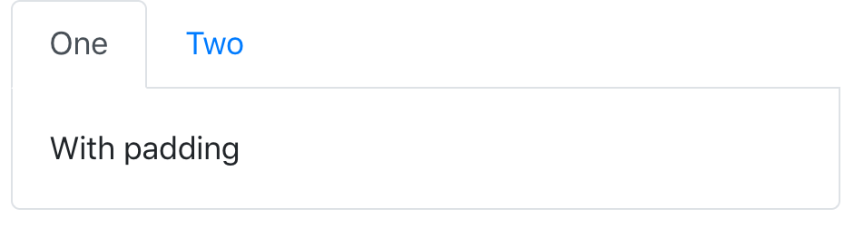
We can help solve this issue by adding some padding the tab’s content
(p-3) as well as a nice border that matches up with the
tab’s borders.
tab <- function(...) {
  shiny::tabPanel(..., class = "p-3 border border-top-0 rounded-bottom")
}
tabsetPanel(
  tab("One", "With padding"),
  tab("Two", "Nice!")
)
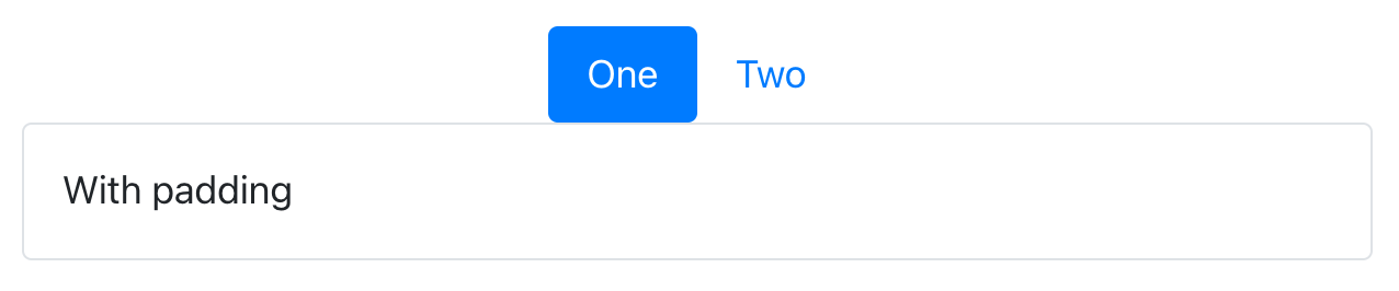
And for tabsetPanel(type="pills") , it looks a bit
better to have a full, rounded, border:
pill <- function(...) {
  shiny::tabPanel(..., class = "p-3 border rounded")
}
tabsetPanel(
  type = "pills",
  pill("One", "With padding"),
  pill("Two", "Nice!")
)
It’s also worth noting that you can also add these classes to rmarkdown tabsets, like so:
Unfortunately, we can’t always rely on the class
argument placing itself on the HTML tag we need to achieve our styling
goals. For example, we can’t simply do
tabsetPanel(class = "justify-content-center", ...) to horizontally
center a tabset. We can, however, leverage Sass’s
@extend rule to essentially add utility classes to the relevant HTML
element(s):
fluidPage(
  theme = bs_theme() %>%
    bs_add_rules("#my-nav { @extend .justify-content-center }"),
  tabsetPanel(
    type = "pills", id = "my-nav",
    pill("One", "With padding"),
    pill("Two", "Nice!")
  )
)
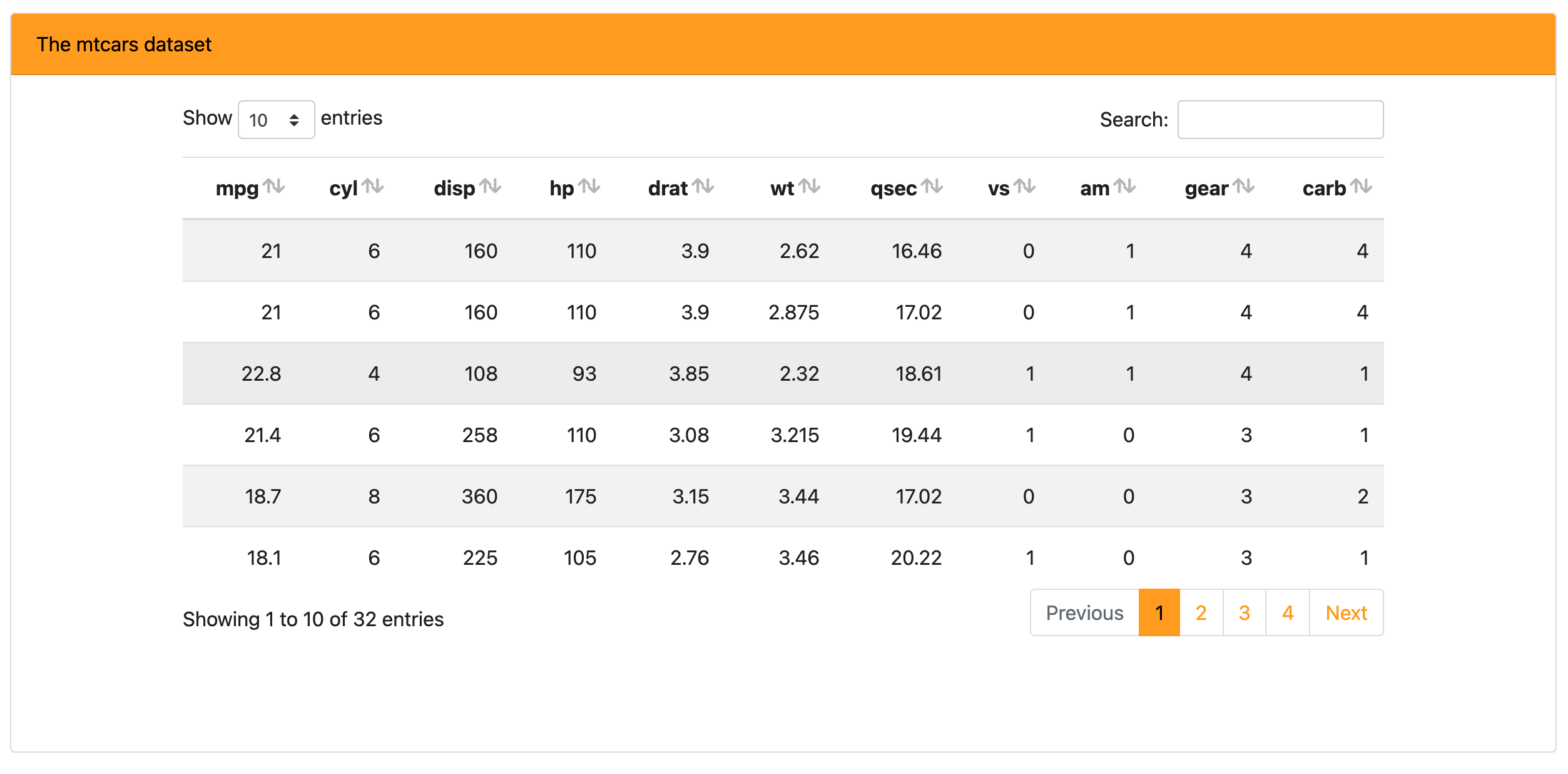
Add background color
Add a bg-* class to any HTML element to set not only its
background color to a theme color (e.g., primary,
secondary, etc), but note that it’ll also make sure the
foreground color properly contrasts the background color (i.e., the
foreground switches from white/black intelligently based on dark/light
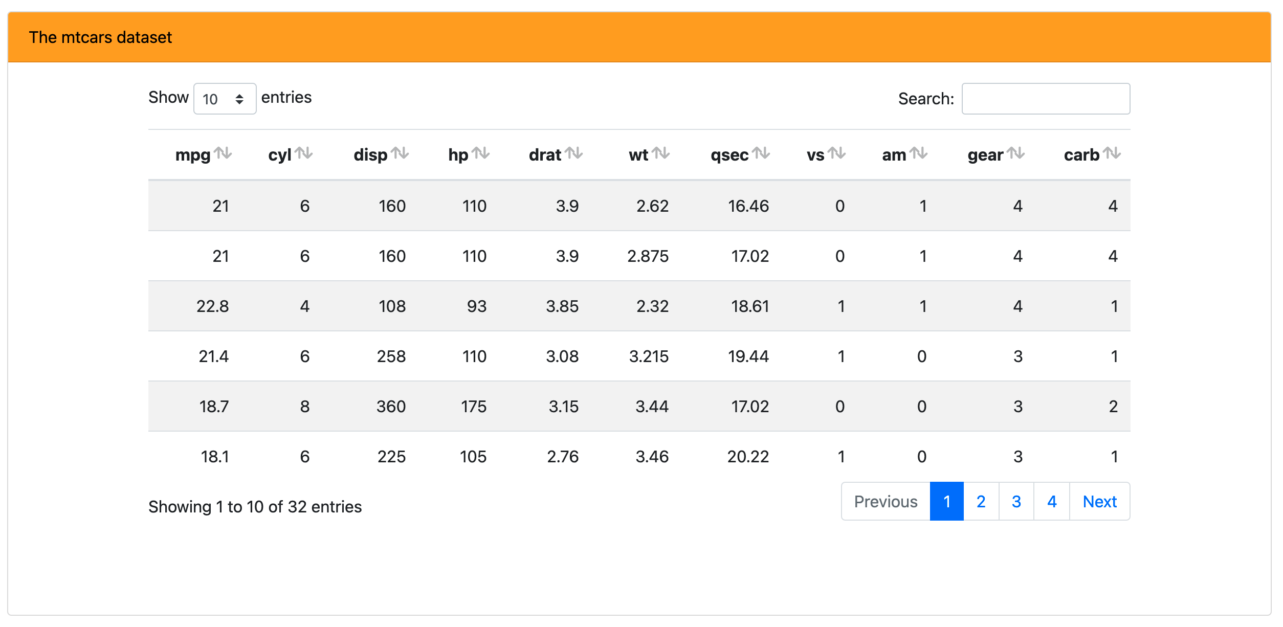
background). Here we use bg-primary on a card
component containing a {DT} table.
bs4_card <- function(body, title) {
  div(
    class = "card",
    div(class = "card-header bg-primary", title),
    div(class = "card-body d-flex justify-content-center", body)
  )
}

shinyApp(
  fluidPage(
    theme = bslib::bs_theme(primary = "orange"),
    uiOutput("dat")
  ),
  function(input, output) {
    output$dat <- renderUI({
      table <- DT::datatable(mtcars, fillContainer = TRUE, style = "bootstrap4", rownames = FALSE)
      bs4_card(table, "The mtcars dataset")
    })
  }
)
Create new utility classes
Bootstrap Sass also has a handful of Sass maps
which allow for easy creation and/or modification of utility classes.
One such case is for creating your own background color utility classes,
say bg-flair via the $theme-colors
map. This could be useful if you wanted to let the
$primary be the default $blue, but use a
bg-flair instead of bg-primary to color the
card’s title:
bs_theme("theme-colors" = "('flair': orange)")