Shiny Dashboard Structure
Background: Shiny and HTML
To understand how the parts of a dashboard work together, we first need to know how a Shiny UI is built, and how it relates to the HTML of a web page.
The HTML tag functions in Shiny, like div() and p() return objects that can be rendered as HTML. For example, when you run these commands at the R console, it will print out HTML:
Paragraph text
Some functions return more complex HTML fragments, and they insulate you, the user, from having to know all the ins and outs of the HTML required to create things like a text input or a sidebar:
The UI for a Shiny app is built out of these pieces of HTML. The shinydashboard package provides a set of functions designed to create HTML that will generate a dashboard. If you copy the UI code for a dashboard page (above) and paste into the R console, it will print out HTML for the dashboard.
Structure overview
The dashboardPage() function expects three components: a header, sidebar, and body:
For more complicated apps, splitting app into pieces can make it more readable:
header <- dashboardHeader()

sidebar <- dashboardSidebar()

body <- dashboardBody()

dashboardPage(header, sidebar, body)
Now we’ll look at each of the three main components of a shinydashboard.
Header
A header can have a title and dropdown menus. Here’s an example:

Header
Setting the title is simple; just use the title argument:
The dropdown menus are generated by the dropdownMenu() function. There are three types of menus – messages, notifications, and tasks – and each one must be populated with a corresponding type of item.
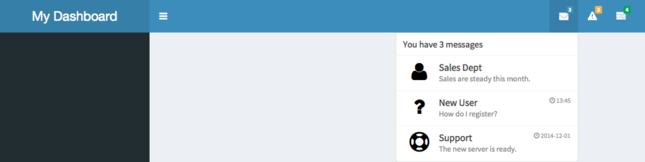
Message menus
A message menu looks like this:
Messages menu
A messageItem contained in a message menu needs values for from and message. You can also control the icon and a notification time string. By default, the icon is a silhouette of a person. (Read more about icons) The time string can be any text. For example, it could be a relative date/time like "5 minutes", "today", or "12:30pm yesterday", or an absolute time, like "2014-12-01 13:45".
dropdownMenu(type = "messages",
  messageItem(
    from = "Sales Dept",
    message = "Sales are steady this month."
  ),
  messageItem(
    from = "New User",
    message = "How do I register?",
    icon = icon("question"),
    time = "13:45"
  ),
  messageItem(
    from = "Support",
    message = "The new server is ready.",
    icon = icon("life-ring"),
    time = "2014-12-01"
  )
)
Dynamic content
In most cases, you’ll want to make the content dynamic. That means that the HTML content is generated on the server side and sent to the client for rendering. In the UI code, you’d use dropdownMenuOutput like this:
And on the server side, you’d generate the entire menu in a renderMenu, like this:
output$messageMenu <- renderMenu({
  # Code to generate each of the messageItems here, in a list. This assumes
  # that messageData is a data frame with two columns, 'from' and 'message'.
  msgs <- apply(messageData, 1, function(row) {
    messageItem(from = row[["from"]], message = row[["message"]])
  })

  # This is equivalent to calling:
  #   dropdownMenu(type="messages", msgs[[1]], msgs[[2]], ...)
  dropdownMenu(type = "messages", .list = msgs)
})
For an interactive example, see the help page for ?renderMenu.
This is a customized version of dynamic UI in Shiny. For more about using dynamic UI, see this example.
Notification menus
This is what a notification menu looks like:
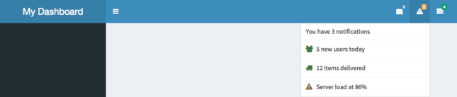
Notifications menu
A notificationItem contained in a notification contains a text notification. You can also control the icon and the status color. The different possible statuses are shown here.
Task menus
This is a task menu:
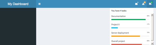
Tasks menu
Task items have a progress bar and a text label. You can also specify the color of the bar. Valid colors are listed in ?validColors.
Disabling the header
If you don’t want to show a header bar, you can disable it with:
Sidebar
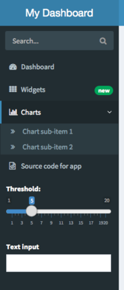
A sidebar is typically used for quick navigation. It can contain menu items that behave like tabs in a tabPanel, as well as Shiny inputs, like sliders and text inputs.
Sidebar
Sidebar menu items and tabs
Links in the sidebar can be used like tabPanels from Shiny. That is, when you click on a link, it will display different content in the body of the dashboard. Here is an example of a simple tabPanel:
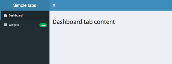
Tabs
When the user clicks on one of the menu items, it switches content in the main body:
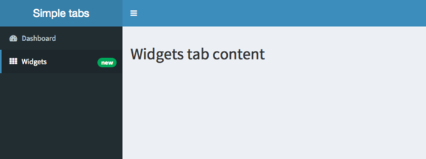
Tabs
The menu items are put in sidebarMenu() as follows. To match up a menuItem with a tabItem, make sure that they have matching values for tabName.
## ui.R ##
sidebar <- dashboardSidebar(
  sidebarMenu(
    menuItem("Dashboard", tabName = "dashboard", icon = icon("dashboard")),
    menuItem("Widgets", icon = icon("th"), tabName = "widgets",
             badgeLabel = "new", badgeColor = "green")
  )
)

body <- dashboardBody(
  tabItems(
    tabItem(tabName = "dashboard",
      h2("Dashboard tab content")
    ),

    tabItem(tabName = "widgets",
      h2("Widgets tab content")
    )
  )
)

# Put them together into a dashboardPage
dashboardPage(
  dashboardHeader(title = "Simple tabs"),
  sidebar,
  body
)menuItems have an option icon, which is created by the icon() function from Shiny. (More information about using icons.) They also have an optional badge, with badgeLabel and badgeColor.
A menuItem can do other things besides control tabs; it can also contain a link to external content, if you supply a value for href. By default, these external links open in a new browser tab or window; this can be controlled with the newtab option.
  menuItem("Source code", icon = icon("file-code-o"),
           href = "https://github.com/rstudio/shinydashboard/")
Bookmarking and restoring selected tabs
As of version 0.14, Shiny has the ability to bookmark and restore the state of an application. To be able to bookmark and restore the selected tabItem in an app built with shinydashboard, you must call sidebarMenu() with an id. For example:
If you’ve used bookmarking in a Shiny app before, you know that the UI must be wrapped in a function. The sidebarMenu() must be called inside the UI function. It does not work to call it outside the UI function, saved the result in a variable, and then use that result in the UI function – if you do this, then the selected tab will save, but it will not restore.
Dynamic content
A sidebar menu can be generated dynamically, with renderMenu and sidebarMenuOutput. Here is an example app with a sidebar that is generated on the server side.
ui <- dashboardPage(
  dashboardHeader(title = "Dynamic sidebar"),
  dashboardSidebar(
    sidebarMenuOutput("menu")
  ),
  dashboardBody()
)

server <- function(input, output) {
  output$menu <- renderMenu({
    sidebarMenu(
      menuItem("Menu item", icon = icon("calendar"))
    )
  })
}

shinyApp(ui, server)
It’s also possible to dynamically generate individual items:
Inputs in the sidebar
A sidebar can also contain ordinary inputs, like sliderInputs and textInputs.
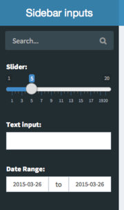
Sidebar inputs
shinydashboard also includes a special type of input, a sidebarSearchForm, which is on top in the screenshot above. This is essentially a specially formatted text input and and actionButton which appears as a magnifying glass icon (the icon can be changed with the icon argument).
For this search form, the corresponding values in the server-side code would be input$searchText and input$searchButton.
Body
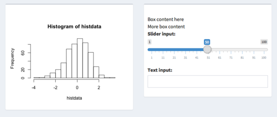
The body of a dashboard page can contain any regular Shiny content. However, if you’re creating a dashboard you’ll likely want to make something that’s more structured. The basic building block of most dashboards is a box. Boxes in turn can contain any content.
Boxes
Boxes are the main building blocks of dashboard pages. A basic box can be created with the box() function, and the contents of the box can be (most) any Shiny UI content.
In a typical dashboard, these boxes would be placed inside a fluidRow() (we’ll see more on dashboard layout later):
# This is just the body component of a dashboard
dashboardBody(
  fluidRow(
    box(plotOutput("plot1")),

    box(
      "Box content here", br(), "More box content",
      sliderInput("slider", "Slider input:", 1, 100, 50),
      textInput("text", "Text input:")
    )
  )
)
Basic boxes
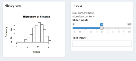
Boxes can have titles and header bar colors with the title and status options. The different possible statuses are shown here.
box(title = "Histogram", status = "primary", plotOutput("plot2", height = 250)),

box(
  title = "Inputs", status = "warning",
  "Box content here", br(), "More box content",
  sliderInput("slider", "Slider input:", 1, 100, 50),
  textInput("text", "Text input:")
)
Box header color and title
You can have solid headers with solidHeader=TRUE, and display a button in the upper right that will collapse the box with collapsible=TRUE:
box(
  title = "Histogram", status = "primary", solidHeader = TRUE,
  collapsible = TRUE,
  plotOutput("plot3", height = 250)
),

box(
  title = "Inputs", status = "warning", solidHeader = TRUE,
  "Box content here", br(), "More box content",
  sliderInput("slider", "Slider input:", 1, 100, 50),
  textInput("text", "Text input:")
)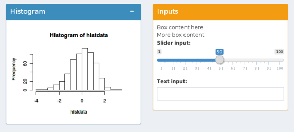
Solid header and collapse
If you want the boxes to not have a gray or colored bar on top, use solidHeader=TRUE and don’t give a value for status:
box(
  title = "Histogram", solidHeader = TRUE,
  collapsible = TRUE,
  plotOutput("plot3", height = 250)
),

box(
  title = "Inputs", solidHeader = TRUE,
  "Box content here", br(), "More box content",
  sliderInput("slider", "Slider input:", 1, 100, 50),
  textInput("text", "Text input:")
)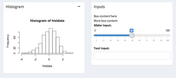
No colored bar
Finally, it’s also possible to have a solid background, with the background option. The different possible colors are shown here.
box(
  title = "Histogram", background = "maroon", solidHeader = TRUE,
  plotOutput("plot4", height = 250)
),

box(
  title = "Inputs", background = "black",
  "Box content here", br(), "More box content",
  sliderInput("slider", "Slider input:", 1, 100, 50),
  textInput("text", "Text input:")
)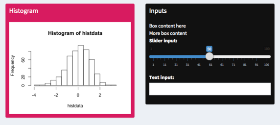
Solid background
tabBox
If you want a box to have tabs for displaying different sets of content, you can use a tabBox.
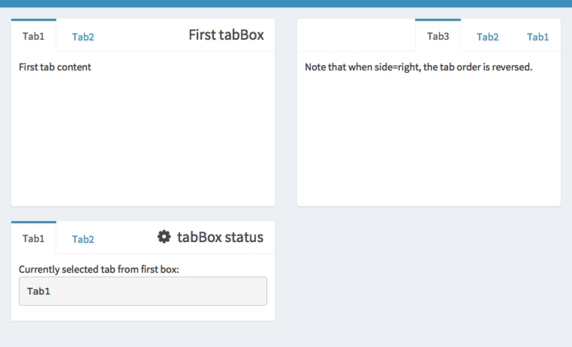
Tabbed boxes
The code to generate this app is below. A tabBox is similar to a tabsetPanel from Shiny in that it takes tabPanels as inputs, allows you to choose which tab is selected, and can be assigned an id. If id is present, you can access which tab is selected from the server; in the example below, it’s accessed with input$tabset1.
A tabBox also has similarities to a regular box from shinydashboard, in that you can control the height, width, and title. You can also choose which side the tabs appear on, with the side argument. Note that if side="right", the tabs will be displayed in reverse order.
body <- dashboardBody(
  fluidRow(
    tabBox(
      title = "First tabBox",
      # The id lets us use input$tabset1 on the server to find the current tab
      id = "tabset1", height = "250px",
      tabPanel("Tab1", "First tab content"),
      tabPanel("Tab2", "Tab content 2")
    ),
    tabBox(
      side = "right", height = "250px",
      selected = "Tab3",
      tabPanel("Tab1", "Tab content 1"),
      tabPanel("Tab2", "Tab content 2"),
      tabPanel("Tab3", "Note that when side=right, the tab order is reversed.")
    )
  ),
  fluidRow(
    tabBox(
      # Title can include an icon
      title = tagList(shiny::icon("gear"), "tabBox status"),
      tabPanel("Tab1",
        "Currently selected tab from first box:",
        verbatimTextOutput("tabset1Selected")
      ),
      tabPanel("Tab2", "Tab content 2")
    )
  )
)

shinyApp(
  ui = dashboardPage(
    dashboardHeader(title = "tabBoxes"),
    dashboardSidebar(),
    body
  ),
  server = function(input, output) {
    # The currently selected tab from the first box
    output$tabset1Selected <- renderText({
      input$tabset1
    })
  }
)
infoBox
There is a special kind of box that is used for displaying simple numeric or text values, with an icon. Here are some examples:
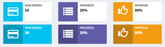
Info boxes
The code to generate these infoBoxes is below. The first row of infoBoxes uses the default setting of fill=FALSE, while the second row uses fill=TRUE.
Since the content of an infoBox will usually be dynamic, shinydashboard contains the helper functions infoBoxOutput and renderInfoBox for dynamic content. The different possible colors are shown here.
library(shinydashboard)

ui <- dashboardPage(
  dashboardHeader(title = "Info boxes"),
  dashboardSidebar(),
  dashboardBody(
    # infoBoxes with fill=FALSE
    fluidRow(
      # A static infoBox
      infoBox("New Orders", 10 * 2, icon = icon("credit-card")),
      # Dynamic infoBoxes
      infoBoxOutput("progressBox"),
      infoBoxOutput("approvalBox")
    ),

    # infoBoxes with fill=TRUE
    fluidRow(
      infoBox("New Orders", 10 * 2, icon = icon("credit-card"), fill = TRUE),
      infoBoxOutput("progressBox2"),
      infoBoxOutput("approvalBox2")
    ),

    fluidRow(
      # Clicking this will increment the progress amount
      box(width = 4, actionButton("count", "Increment progress"))
    )
  )
)

server <- function(input, output) {
  output$progressBox <- renderInfoBox({
    infoBox(
      "Progress", paste0(25 + input$count, "%"), icon = icon("list"),
      color = "purple"
    )
  })
  output$approvalBox <- renderInfoBox({
    infoBox(
      "Approval", "80%", icon = icon("thumbs-up", lib = "glyphicon"),
      color = "yellow"
    )
  })

  # Same as above, but with fill=TRUE
  output$progressBox2 <- renderInfoBox({
    infoBox(
      "Progress", paste0(25 + input$count, "%"), icon = icon("list"),
      color = "purple", fill = TRUE
    )
  })
  output$approvalBox2 <- renderInfoBox({
    infoBox(
      "Approval", "80%", icon = icon("thumbs-up", lib = "glyphicon"),
      color = "yellow", fill = TRUE
    )
  })
}

shinyApp(ui, server)
valueBox
valueBoxes are similar to infoBoxes, but have a somewhat different appearance.
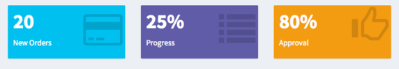
Value boxes
The code to generate these valueBoxes is below. As with the infoBoxes above, some of these valueBoxes are static and some are dynamic.
library(shinydashboard)

ui <- dashboardPage(
  dashboardHeader(title = "Value boxes"),
  dashboardSidebar(),
  dashboardBody(
    fluidRow(
      # A static valueBox
      valueBox(10 * 2, "New Orders", icon = icon("credit-card")),

      # Dynamic valueBoxes
      valueBoxOutput("progressBox"),

      valueBoxOutput("approvalBox")
    ),
    fluidRow(
      # Clicking this will increment the progress amount
      box(width = 4, actionButton("count", "Increment progress"))
    )
  )
)

server <- function(input, output) {
  output$progressBox <- renderValueBox({
    valueBox(
      paste0(25 + input$count, "%"), "Progress", icon = icon("list"),
      color = "purple"
    )
  })

  output$approvalBox <- renderValueBox({
    valueBox(
      "80%", "Approval", icon = icon("thumbs-up", lib = "glyphicon"),
      color = "yellow"
    )
  })
}

shinyApp(ui, server)
Layouts
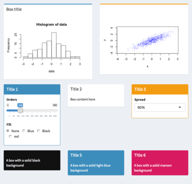
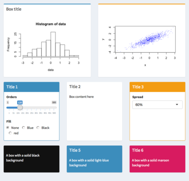
Laying out the boxes requires a little knowledge of the Bootstrap grid layout system. The body can be treated as a region divided in to 12 columns of equal width, and any number of rows, of variable height. When you place a box (or other item) in the grid, you can specify how many of the 12 columns you want it to occupy. In this screenshot, the first row of boxes each are 4 columns wide, and the second column of boxes are each 6 columns wide.
Broadly speaking, there are two ways of laying out boxes: with a row-based layout, or with a column-based layout.
Row-based layout
In a row-based layout, boxes must go in a row created by fluidRow(). Rows have a grid width of 12, so a box with width=4 takes up one-third of the width, and a box with width=6 (the default) takes up half of the width.
With a row-based layout, the tops of the boxes in each row will be aligned, but the bottoms may not be – it depends on the content of each box. A row-based layout might look like this:
Row-based layout
This code is the basic scaffolding for these three rows of boxes:
body <- dashboardBody(
  fluidRow(
    box(title = "Box title", "Box content"),
    box(status = "warning", "Box content")
  ),

  fluidRow(
    box(
      title = "Title 1", width = 4, solidHeader = TRUE, status = "primary",
      "Box content"
    ),
    box(
      title = "Title 2", width = 4, solidHeader = TRUE,
      "Box content"
    ),
    box(
      title = "Title 1", width = 4, solidHeader = TRUE, status = "warning",
      "Box content"
    )
  ),

  fluidRow(
    box(
      width = 4, background = "black",
      "A box with a solid black background"
    ),
    box(
      title = "Title 5", width = 4, background = "light-blue",
      "A box with a solid light-blue background"
    ),
    box(
      title = "Title 6",width = 4, background = "maroon",
      "A box with a solid maroon background"
    )
  )
)

# We'll save it in a variable `ui` so that we can preview it in the console
ui <- dashboardPage(
  dashboardHeader(title = "Row layout"),
  dashboardSidebar(),
  body
)

# Preview the UI in the console
shinyApp(ui = ui, server = function(input, output) { })
It’s possible to force the boxes to all be the same height, by setting height. In contrast to width, which is set using the 12-wide Bootstrap gride, height is specified in pixels. (This difference is because HTML/CSS layout handles width and height differently. Unfortunately, there isn’t a straightforward way to get equal column heights with Bootstrap.)
For example:
If we set the height of all the boxes, we can get a dashboard like this:
Row-based layout with fixed height
Column-based layout
With a column-based layout, you first create a column and then place boxes within those columns.
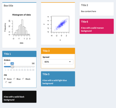
Column-based layout
The code below is the basic scaffolding for this column-based layout. Notice that within the fluidRow, there are columns with a specified width, and then each of the boxes in the column have width=NULL.
body <- dashboardBody(
  fluidRow(
    column(width = 4,
      box(
        title = "Box title", width = NULL, status = "primary",
        "Box content"
      ),
      box(
        title = "Title 1", width = NULL, solidHeader = TRUE, status = "primary",
        "Box content"
      ),
      box(
        width = NULL, background = "black",
        "A box with a solid black background"
      )
    ),

    column(width = 4,
      box(
        status = "warning", width = NULL,
        "Box content"
      ),
      box(
        title = "Title 3", width = NULL, solidHeader = TRUE, status = "warning",
        "Box content"
      ),
      box(
        title = "Title 5", width = NULL, background = "light-blue",
        "A box with a solid light-blue background"
      )
    ),

    column(width = 4,
      box(
        title = "Title 2", width = NULL, solidHeader = TRUE,
        "Box content"
      ),
      box(
        title = "Title 6", width = NULL, background = "maroon",
        "A box with a solid maroon background"
      )
    )
  )
)

# We'll save it in a variable `ui` so that we can preview it in the console
ui <- dashboardPage(
  dashboardHeader(title = "Column layout"),
  dashboardSidebar(),
  body
)

# Preview the UI in the console
shinyApp(ui = ui, server = function(input, output) { })
Mixed row and column layout
It’s also possible to use a mix of rows and columns. In this example, the top two boxes are in a row, and the rest are in columns:
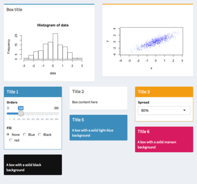
Mixed row and column layout
This is the scaffolding for this mixed layout:
body <- dashboardBody(
  fluidRow(
    box(
      title = "Box title", width = 6, status = "primary",
      "Box content"
    ),
    box(
      status = "warning", width = 6,
      "Box content"
    )
  ),

  fluidRow(
    column(width = 4,
      box(
        title = "Title 1", width = NULL, solidHeader = TRUE, status = "primary",
        "Box content"
      ),
      box(
        width = NULL, background = "black",
        "A box with a solid black background"
      )
    ),

    column(width = 4,
      box(
        title = "Title 3", width = NULL, solidHeader = TRUE, status = "warning",
        "Box content"
      ),
      box(
        title = "Title 5", width = NULL, background = "light-blue",
        "A box with a solid light-blue background"
      )
    ),

    column(width = 4,
      box(
        title = "Title 2", width = NULL, solidHeader = TRUE,
        "Box content"
      ),
      box(
        title = "Title 6", width = NULL, background = "maroon",
        "A box with a solid maroon background"
      )
    )
  )
)

# We'll save it in a variable `ui` so that we can preview it in the console
ui <- dashboardPage(
  dashboardHeader(title = "Mixed layout"),
  dashboardSidebar(),
  body
)

# Preview the UI in the console
shinyApp(ui = ui, server = function(input, output) { })Next: learn about customizing the appearance of a dashboard.