An important part of spatial visualization is mapping variables to colors. While R has no shortage of built-in functionality to map values to colors, we found that there was enough friction in the process to warrant introducing some wrapper functions that do a lot of the work for you.
To that end, we’ve created a family of color*()
convenience functions that can be used to easily generate palette
functions. Essentially, you call the appropriate color function
with 1) the colors you want to use and 2) optionally, the range of
inputs (i.e., domain) that are expected. The color function
returns a palette function that can be passed a vector of input values,
and it’ll return a vector of colors in #RRGGBB(AA)
format.
# Call the color function (colorNumeric) to create a new palette function
pal <- colorNumeric(c("red", "green", "blue"), 1:10)
# Pass the palette function a data vector to get the corresponding colors
pal(c(1,6,9))
#> [1] "#FF0000" "#52E74B" "#6854D8"
There are currently three color functions for dealing with continuous
input: colorNumeric(), colorBin(), and
colorQuantile(); and one for categorical input,
colorFactor().
Common parameters
The four color functions all have two required arguments,
palette and domain.
The palette argument specifies the colors to map the
data to. This argument can take one of several forms:
- The name of a preset palette from the
RColorBrewerpackage, e.g.,"RdYlBu","Accent", or"Greens". - The full name of a
viridispalette:"magma","inferno","plasma","viridis","cividis","rocket","mako", or"turbo". - A character vector of RGB or named colors, e.g.,
palette(),c("#000000", "#0000FF", "#FFFFFF"),topo.colors(10). - A function that receives a single value between 0 and 1 and returns
a color, e.g.,:
colorRamp(c("#000000", "#FFFFFF"), interpolate="spline")
The domain argument tells the color function the range
of input values. You can pass NULL here to create a palette
function that doesn’t have a preset range; the range will be inferred
from the data each time you invoke the palette function. If you use a
palette function multiple times across different data, it’s important to
provide a non-NULL value for domain so the
scaling between data and colors is consistent.
Coloring continuous data
# From http://data.okfn.org/data/datasets/geo-boundaries-world-110m
countries <- sf::read_sf("https://rstudio.github.io/leaflet/json/countries.geojson")
map <- leaflet(countries)
We’ve loaded some shape data for countries, including a numeric field
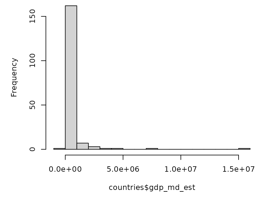
gdp_md_est which contains GDP estimates.
Continuous input, continuous colors (colorNumeric)
Let’s start by mapping GDP values directly to the
"Blues" palette from Color Brewer 2. We’ll use
colorNumeric() to create a mapping function. The
"Blues" palette only contains nine colors, but
colorNumeric() interpolates these colors so we get
continuous output.
# Create a continuous palette function
pal <- colorNumeric(
  palette = "Blues",
  domain = countries$gdp_md_est)
The palette parameter is the ordered list of colors you
will map colors to. In this case we used a Color Brewer palette, but we
could’ve used c("white", "navy") or
c("#FFFFFF", "#000080") for a similar effect. You can also
pass more than two colors, for a diverging palette for example. And for
maximum flexibility, you can even pass a function that takes a numeric
value over the interval [0,1] and returns a color.
The second parameter, domain, indicates the set of input
values that we are mapping to these colors. For
colorNumeric(), you can provide either a min/max as in this
example, or a set of numbers that colorNumeric() can call
range() on.
The result is pal, a function that can accept numeric
vectors with values in the range
range(countries$gdp_md_est) and return colors in
"#RRGGBB" format.
# Apply the function to provide RGB colors to addPolygons
map %>%
  addPolygons(stroke = FALSE, smoothFactor = 0.2, fillOpacity = 1,
    color = ~pal(gdp_md_est))
Continuous input, discrete colors (colorBin() and
colorQuantile())
colorBin() maps numeric input data to a fixed number of
output colors using binning (slicing the input domain up by value).
You can specify either the exact breaks to use, or the desired number
of bins. Note that in the latter case, if pretty = TRUE
(the default) you’ll end up with nice round breaks but not necessarily
the number of bins you wanted.
binpal <- colorBin("Blues", countries$gdp_md_est, 6, pretty = FALSE)

map %>%
  addPolygons(stroke = FALSE, smoothFactor = 0.2, fillOpacity = 1,
    color = ~binpal(gdp_md_est))
colorQuantile() maps numeric input data to a fixed
number of output colors using quantiles (slicing the input domain into
subsets with equal numbers of observations).
qpal <- colorQuantile("Blues", countries$gdp_md_est, n = 7)
map %>%
  addPolygons(stroke = FALSE, smoothFactor = 0.2, fillOpacity = 1,
    color = ~qpal(gdp_md_est))
Coloring categorical data
For categorical data, use colorFactor(). If the
palette contains the same number of elements as there are
factor levels, then the mapping will be 1:1; otherwise, the palette will
be interpolated to produce the desired number of colors.
You can specify the input domain either by passing a factor or
character vector to domain, or by providing levels directly
using the levels parameter (in which case the
domain will be ignored).
# Make up some random levels. (TODO: Better example)
countries$category <- factor(sample.int(5L, nrow(countries), TRUE))

factpal <- colorFactor(topo.colors(5), countries$category)

leaflet(countries) %>%
  addPolygons(stroke = FALSE, smoothFactor = 0.2, fillOpacity = 1,
    color = ~factpal(category))