This article is intended for developers of custom Shiny input widgets, or anyone familiar with HTML/JavaScript/CSS who wants to customize the display of validation errors raised by shinyvalidate.
When it comes to error display, shinyvalidate provides three levels of support:
- It just works: The most common widgets are supported right out of the box. Certainly this includes the input controls that are included with the shiny package.
- Widget-level support: Authors of custom input widgets have total control over the display of validation errors for their widgets, if they choose to provide an implementation.
- App-level overrides: App authors may find themselves using custom input widgets that are not shinyvalidate-compatible, or are unhappy with the default behavior of shinyvalidate or the customizations made by a widget author. These app authors should have some recourse that doesn’t require making changes to shinyvalidate or the widget package–though they will be required to know some JavaScript.
These are implemented in JavaScript as three distinct “strategies”. When shinyvalidate’s display logic is invoked to show a specific error for a specific Shiny input, these strategies are tried in turn until one succeeds. The order that they are tried is the reverse of how they’re listed above (and below), though: app-level overrides take the highest priority, then widget-level support, then the default “it just works”.
It Just Works: Built-in support for Bootstrap 3
At the time of this writing, Shiny’s built-in user interface components are written using the Bootstrap CSS framework, version 3. Bootstrap 3 defines certain markup and CSS patterns to follow for creating input controls, and Shiny’s built-in components follow those patterns. Bootstrap also defines patterns for displaying validation errors, and if the input in question follows Bootstrap 3 conventions, then shinyvalidate will automatically use those patterns.
Here, for example, is the HTML used to generate a simple text input in Shiny:
<div class="form-group shiny-input-container">
  <label class="control-label" for="email">Email address</label>
  <input id="email" type="text" class="form-control" value=""/>
</div>
shinyvalidate will take the input element and look at the element
itself, then its containing elements, for the form-group
CSS class. If this class is found, then a validation message will be
displayed by 1) adding the has-error CSS class to the
form-group, and 2) adding a new
<span class="help-block shiny-validation-message">
element as the last child of the form-group.
The following code snippet is the same as the above, except for these two changes, which are highlighted:
<div class="form-group shiny-input-container has-error">
  <label class="control-label" for="email">Email address</label>
  <input id="email" type="text" class="form-control" value=""/>
  <span class="help-block shiny-validation-message">Required</span>
</div>
Note that this strategy covers, but is not limited to, the
built-in Shiny input widgets. Any third-party Shiny input widget that
uses a containing element with .form-group will be assumed
to be compatible with this treatment.
A note about Bootstrap v4
At the time of this writing, the Shiny team is in the midst of a large project to bring support for Bootstrap v4 to Shiny. As this effort gets closer to release, we plan to bring Bootstrap v4 compatibility to shinyvalidate as well; and in general, we hope to achieve “It Just Works” integration with whatever CSS frameworks are most commonly used with Shiny.
Widget-level support: Input binding customization
Custom input widgets that don’t depend on Bootstrap can define their
own behavior for displaying validation errors, by implementing two new
methods on their JavaScript InputBinding
objects.
binding.setInvalid(el, data)will be called when a validation error should be displayed. Thedataobject has two fields:data.typeis currently always"error"(in the future we may add"warning"and"info"types), anddata.messagewill be a non-empty string specifying the message to display. Besides displaying the message, other UI changes/CSS adjustments should be made to make it clear that the input is invalid (having the control label and border colors turn red, or background color turning pink, for example).binding.clearInvalid(el)will be called when a validation error is no longer appropriate to be displayed. Any previously added validation message should be removed, and any CSS adjustments (like the aforementioned red labels and borders) should be reversed.
Note that shinyvalidate will invoke setInvalid and
clearInvalid in seemingly random order. It may repeatedly
call clearInvalid on an input without intervening
setInvalid calls. It may call setInvalid
multiple times in a row with the same data. Therefore, both
setInvalid and clearInvalid must be prepared
to deal with inputs in “normal” or “error” states.
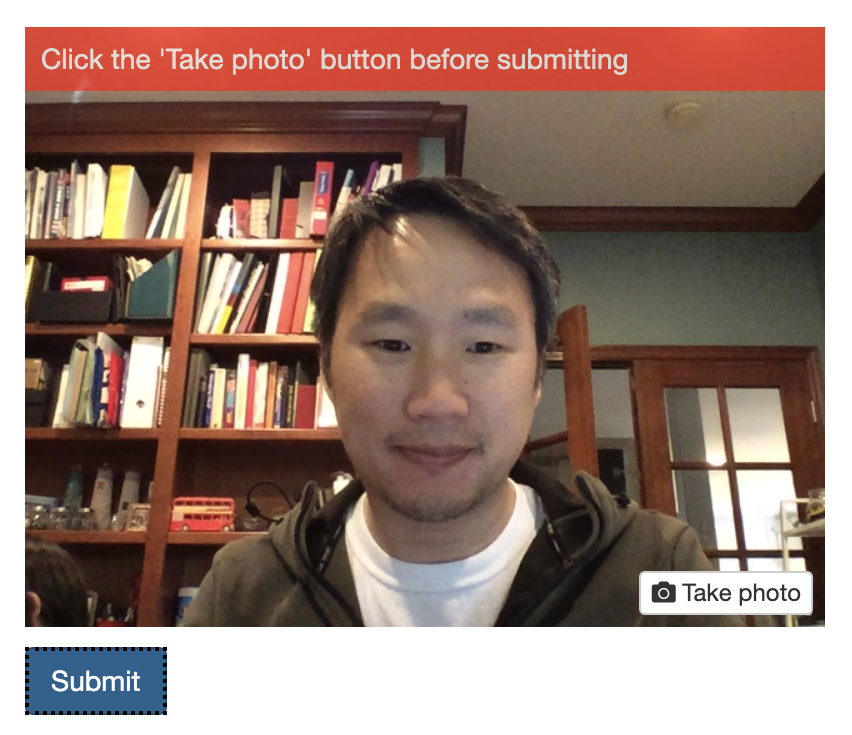
Example 03_custom_inputs [source,
live demo TODO] uses a custom input widget to implement a webcam capture
input, and uses setInvalid/clearInvalid
methods to overlay the validation message on top of the image
preview:
App-level overrides: Event handlers
Since it’s always possible that something about your application causes the above strategies to not make sense, you can choose to override those strategies using jQuery event handlers.
Here’s what the JavaScript code for this might look like:
$(document).on("shinyvalidate:show", function(event) {
  let el = event.el;
  let binding = event.binding;
  let id = event.id;
  let type = event.type; // always "error"
  let message = event.message;
  event.preventDefault();

  // Add logic to show (or replace) error message on element `el`
});

$(document).on("shinyvalidate:clear", function(event) {
  let el = event.el;
  let binding = event.binding;
  let id = event.id;
  event.preventDefault();

  // Add logic to clear error (if one exists) from element `el`
});
The following properties are available on the event
object:
el- The HTML element for the relevant input. This is a regular HTML element object, not a jQuery object–you’ll need to call$(el)yourself if you need jQuery functionality.binding- The ShinyInputBindingobject.id- A string indicating the input ID.type- Currently hardcoded to"error". (In the future, we may introduce other types like"warning"and"info".)message- A textual string (not HTML) indicating the message to be displayed.
Important: The event object’s
preventDefault() method must be called to prevent the two
other strategies (input binding and Bootstrap) from being attempted.
(This allows event handlers to decide to handle error display for only a
subset of inputs, for example.)
If you haven’t needed to include custom JavaScript for your Shiny app before, see this article to learn about the various options you have for doing so.