Alternate Layouts
alternate-layouts.RmdYour app is likely to be viewed in different scenarios on different devices. This means it’s important to make sure it looks good in all of those scenarios. A nice grid layout with lots of side-by-side panels won’t work too well if your viewer is looking at it on a small phone screen.
To account for these situations gridlayout allows you to
specify “alternate” layouts for your app. These are distinct layout’s
that determine how your app looks on different screen sizes. Most of the
time this is going to be used for making a layout for the afformentioned
phone scenario, but they can be defined for any page width range.
Example
Here we define a basic layout for an app with a header on top, a sidebar on the side, and a plot. We also define a layout for mobile that is a stack of all of those things, placing what was the “sidebar” now just below the header. There’s also a super-wide-screen layout. Perhaps for an ultrawide monitor that places all the items side by side.
main_layout <- c(
  "10px 200px   1fr   ",
  "70px header  header",
  "1fr  sidebar plot  "
)

mobile_layout <- c(
  "10px  1fr    ",
  "100px header ",
  "250px sidebar",
  "400px plot   "
)

big_screen_layout <- c(
  "10px 250px   250px  1fr ",
  "1fr  header sidebar plot"
)

new_gridlayout(
  main_layout,
  alternate_layouts = list(
    list(
      layout = mobile_layout,
      width_bounds = c(max = 600)
    ),
    list(
      layout = big_screen_layout,
      width_bounds = c(min = 1600)
    )
  )
)
## gridlayout of 3 elements:
##        200px   1fr
##   70px header  header
##   1fr  sidebar plot
## Gap of 10px. Total height of 100%.
##
## Alternate layouts:
##
##   - Width < 600px
##            1fr
##     100px header
##     250px sidebar
##     400px plot
##   Gap of 10px. Total height of auto.
##
##   - Width > 1600px
##          250px  250px   1fr
##     1fr header sidebar plot
##   Gap of 10px. Total height of 100%.
Syntax
The alternate layouts are provided via the
alternate_layouts argument in
new_gridlayout(). This takes the form of a list of layouts
containing:
- A
layouttable (or existinggridlayoutobject) -
width_boundsthat the layout should occur for. For instance, outmobile_layoutis active when the viewing device’s screen is narrower than600pixels and ourbig_screen_layoutis active when the screen is larger than1600pixels. You can also set upper and lower bounds in case you wanted to have intermediate layouts (perhaps a tablet layout for between600and1000pixels in width.) - An optional
container_height. Typicallygridlayoutis smart enough to figure this one out for you, however.
Output
The following are screenshots of the exact same app at different screen sizes using the layouts above.
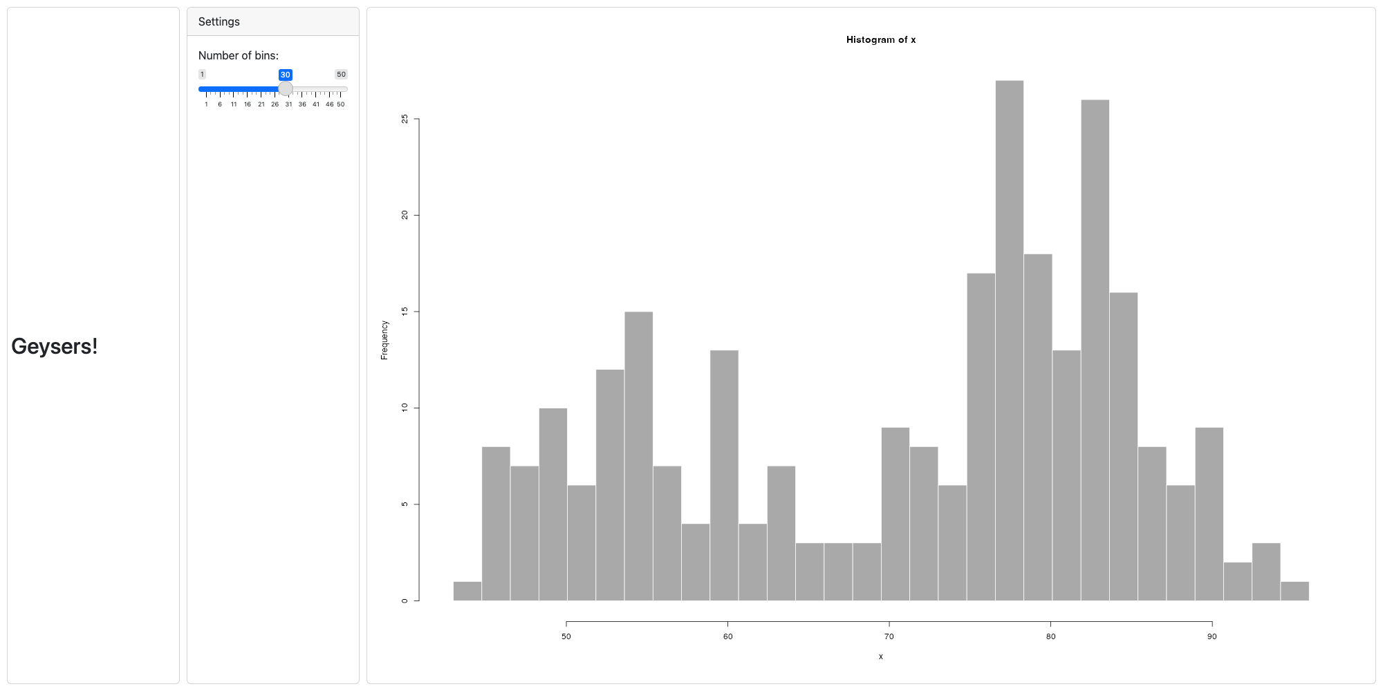
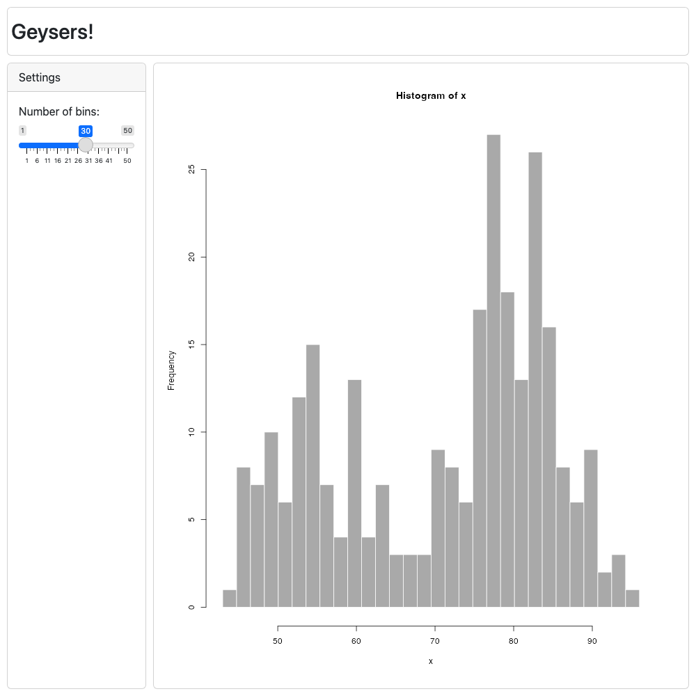
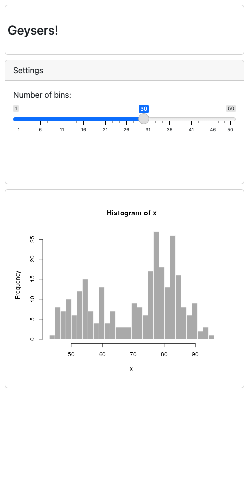
Default mobile layout
If no alternate layouts are specified, a mobile layout is
automatically generated by simply stacking all the panels in your app at
300px in height.
main_layout <- c(
  "10px 200px   1fr   ",
  "70px header  header",
  "1fr  sidebar plot  "
)

new_gridlayout(main_layout)
## gridlayout of 3 elements:
##        200px   1fr
##   70px header  header
##   1fr  sidebar plot
## Gap of 10px. Total height of 100%.
##
## Alternate layouts:
##
##   - Width < 500px
##            1fr
##     85px  header
##     350px sidebar
##     350px plot
##   Gap of 10px. Total height of auto.
If you don’t want this (say you’re targeting mobile by default
already) you can set alternate_layouts to
NULL.
new_gridlayout(main_layout, alternate_layouts = NULL)
## gridlayout of 3 elements:
##        200px   1fr
##   70px header  header
##   1fr  sidebar plot
## Gap of 10px. Total height of 100%.